
Human mind is equivocal. Not that it’s a new posit, but this time, the proof is banked well on the ability of a mind to create, store, and believe in sequencing traits. After all, it’s the same mind that invents the state-of-the-art machine intelligence that also postulates the thought-experiment, Roko’s Basilisk. At any instant, mind can be both an assailable ground and a calculated territory. This tendency rises from simple (yet growing) actions of recognizing patterns, mapping to extant beliefs, and rooting to fill in the wanted knowledge — all related to psychology.
When it comes to the product landscape, it’s the same psychological behaviors and credence that help users take required actions, fulfill product journeys, and make efforts to indulge in experiences you curate for them. The North Star lies in striking users the right away — by investing in their habits, kindling sense of pursuit, and finally making them take lesser deviations. This article covers the three everyday psychological principles that’ll nudge your users to interact better and deeper with your products.
Let ‘recall’ rest as ‘recognition’ runs
Let’s recall…Well, this phrase for a moment brings in a fleeting fear, in retrieving information from memory. In Neuroanatomy, while the velocity of the cerebral blood flow in about six regions can signify different ways of recall and retrieval, studies and experiments show a synchrony between two such specific brain regions (hippocampus rhinal cortex) induces recall.
Recall however comes with a downside, when considering its effect on product interaction. Every time a user tries to take an action, providing them newer experiences to build on, psychologically, fails in performance. It’s like making you think of the whole grocery list, whenever you move past each rack in a supermarket. The result? Attention to detail gets you thinking over and over before every action completion. Well, the product may be considered like a physical shop — albeit, it requires an amicable approach for users to engage with. And, thus comes ‘recognition,’ the right neuropsychological technique to galvanize user interactions.
Recognition is a method of relating to previously encountered activity and behavior just as you see it shown in front of you. And, now, you’ll understand why kids like ‘choose the best answer’ vs ‘fill in the blank’ homework. The former triggers mapping of patterns, just as the options are shown to you vividly, while the latter shows you no signs rather makes you frantically fetch details from memory. With recognition, decision-making inside a product is straightforward, less time-consuming, and even better, habit-building.
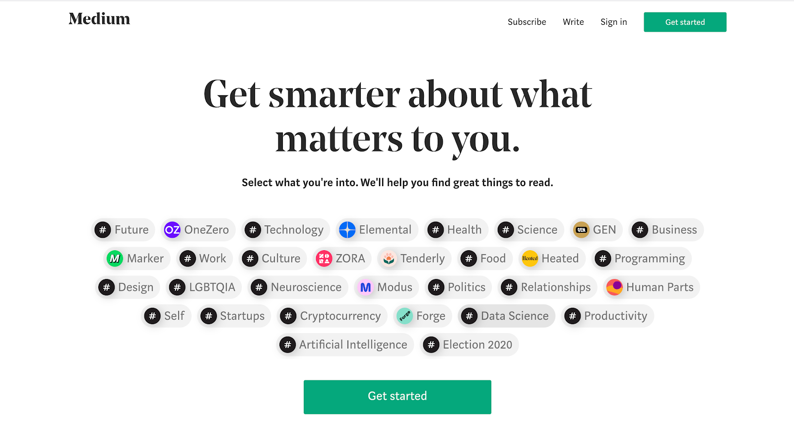
Now, let’s say someone signs up for Medium, and enter into the product. Boom! Don’t we all want curated and personalized reading suggestions? Here’s how the product team of Medium helps a user do it — letting them recognize what topics stand important for them (not recall and fill) and tailor-make their own e-reading journal.
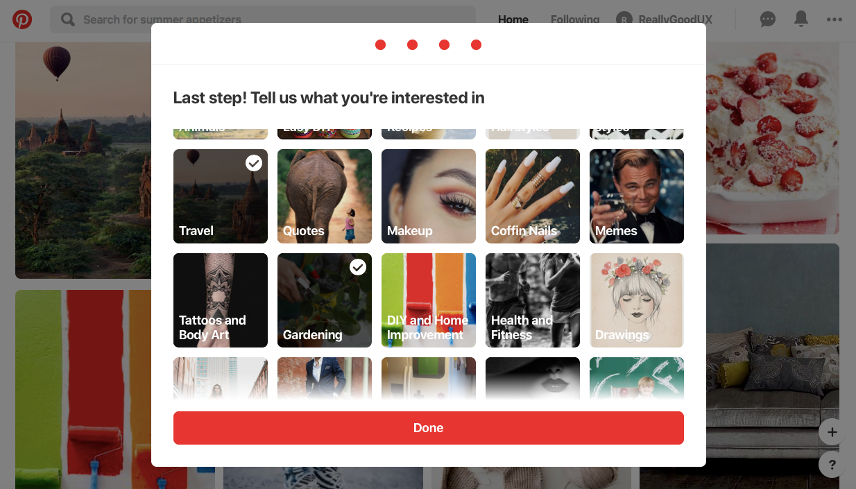
And, so did Pinterest, to help develop one’s very-own storyboard for every day.
The two social-media platforms — Twitter and LinkedIn — do their bit of recognition building by helping you discover like-minded people, just as you finish sending a connection request or following a person. In both of these cases, a list of suggested options to stay in touch or follow helps you recognize more people from your extended circles and be informed about professionals.
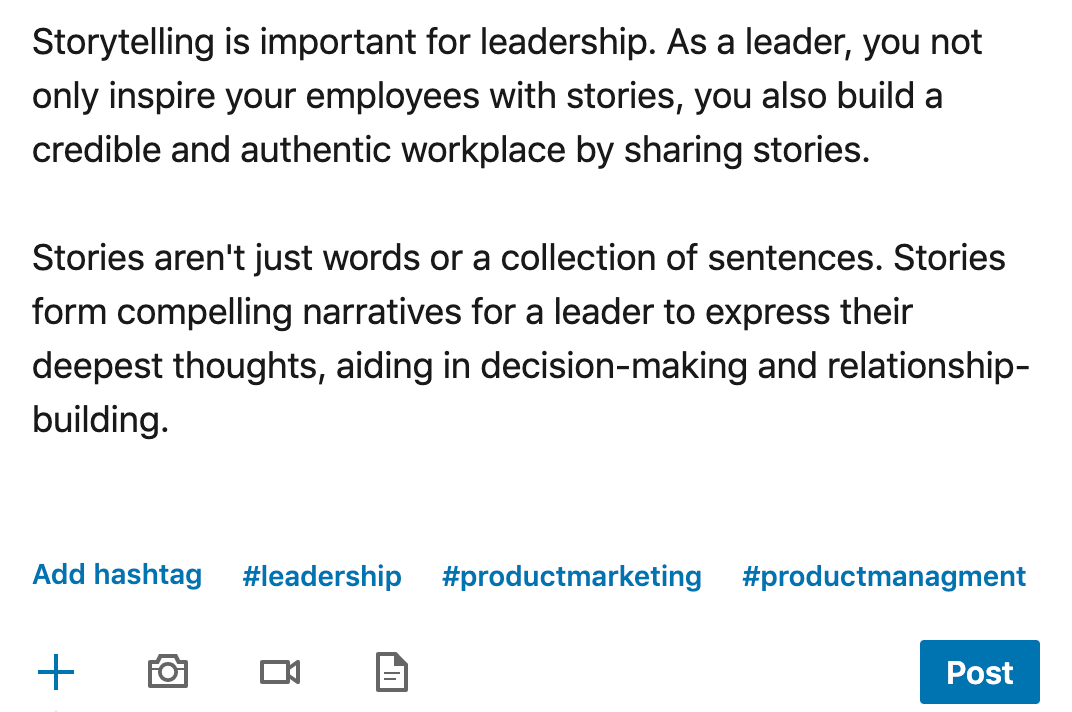
LinkedIn’s auto-fill hashtag option also suggests relevant and trending hashtags for a post, just as one types the content, based on their past hashtag usage as well. This way, a user not only saves time but also ensures their post is pertinent with some of the previous thoughts they shared on their feed as well.
Not just with product onboarding or actions, but you can also help users recognize and talk about their product experiences through feedback and surveys shown within the application. The questions posed to the users need to be specific and pattern oriented, insomuch that you’ll come to understand everything from the responses they choose — from the most-used features and product satiability to likeliness of recommending the product to others.
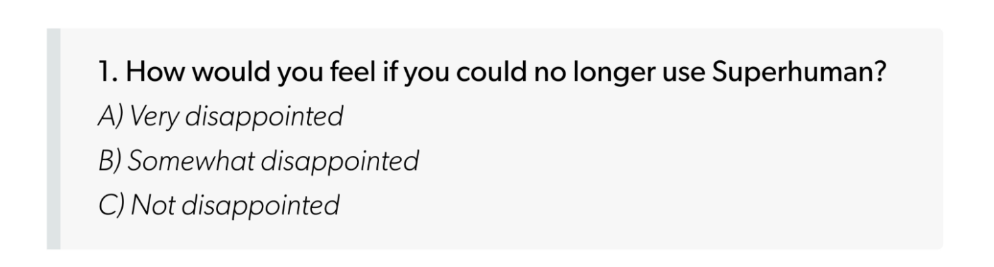
Here’s Superhuman, ensuring their survey sent as email still instills the product experience in a user’s mind, and makes them recognize (and hence subtly increase) their product interactions.
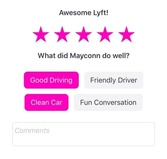
And, there’s Lyft, still getting the “how was your product experience” subjective question right, with specific recognition patterns. Why recall when you can simply recognize now!
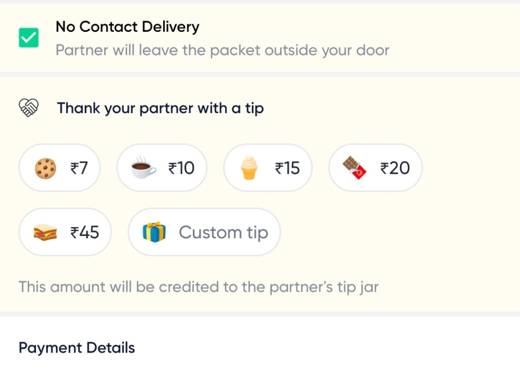
And comes the Indian delivery player, Dunzo, to ensure a user takes an extra step towards empathy. Not the usual way of tipping, right? Makes you recognize the value of sharing a cookie, meal, or a chocolate, by taking off the focus from mere monetary attachment, and hey, increasing their product interaction still.
“And, to put it in a nutshell — first help users recognize, so they automatically recall.”
Preserve perceptual experiences through affordance
Shapes, objects, and layouts — all of these have physical significance and hence are action-oriented. Products are made up of numerous designs and actions, and with every move, it’s important to let a user know about their capacity to do something i.e. prove to them the affordance for an action. When designs are perceivable, they’re receptive by the users based on their collective (past) knowledge, and hence induce the users to take necessary actions towards completion. This is what Donald Norman puts forward as ‘perceived affordance.’
As much as the concept depends on the way products are designed, it also takes the route to psychology, once again playing with users’ memory cells. Well, one could argue why all of this needs to take precedence. It’s easy — we want an apple to look like an apple, wherever it is; digital or physical.
Starting with seeing an object, to comprehending and performing an action with it, affordance is the ability that gets reflected out of a human-centered or user-centric interaction. Appearances, along with cognitive, motor, and perceptual factors like touch, need to be mimicked in digital just as how they’d function together physically.
A user sees a button; they immediately map it with their mental schema made up of perceived knowledge; now, they corroborate the action they want to perform with it; and then, the user clicks the button, knowing what’s in store. This is an example of good affordance.
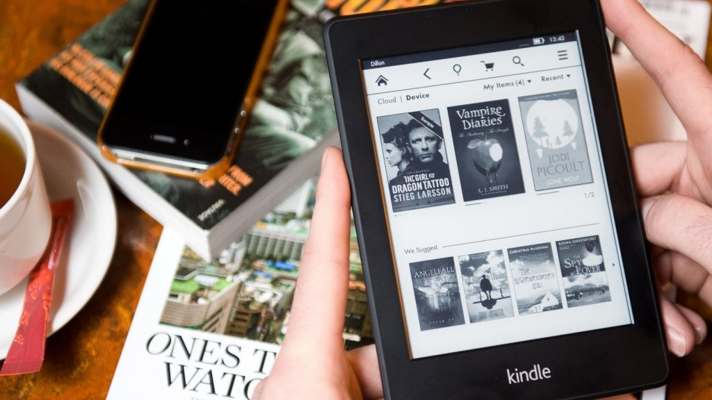
Let’s start by reminiscing about one of the oft-used objects of interactivity, especially for bibliophiles — Kindle. While proving to be wanting of physical touch, Kindle still proves to enter the good affordance category. Why? Thanks to the interaction that it provides. From turning pages to highlighting sentences, a user perfectly does actions the way they’d do with a book. The electronic ink technology along with the refracted light surrounding produces a real book-reading experience, when compared to other devices like tablets that use a built-in LCD lighting of the screen.
How about a perceived digital immersion? That’s what Apple’s GarageBand would provide — the comfort of tuning strings, keys, and percussions, without the actual hefty models around. Every musical instrument is deftly packed up in the application, with little details like tones and chords, that work the same way as in a physical setup. Now, good affordance (read indulgence) isn’t?

Sometimes, it’s not all about complete physical or digital models, but effortless operational aspects within a product — like scrolling carousels, dragging a cursor, or pressing a button.
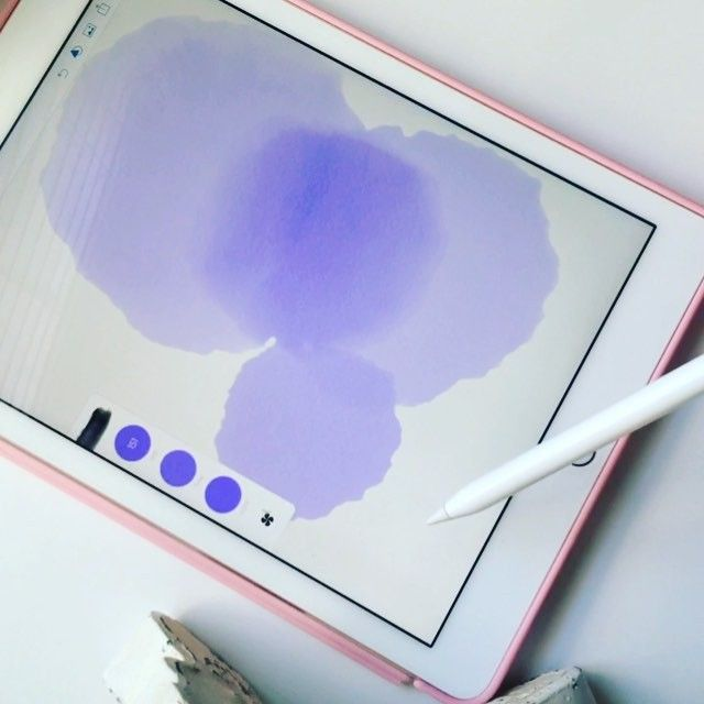
Adobe Illustrator set of apps neatly replicate the use of real-time haired brushes into the digital screen. Just a touch of a button brings in the watercolor wash while dragging or swiping the icon can increase or decrease the transparency of the color from the chosen palette. Not to leave out the ‘pencil’ that today’s millennial population knows, it can definitely create experiences beyond boundaries. But, hey, at the end of the day, they’re still digitally called pencil and brush — the real giants of perceived affordances.
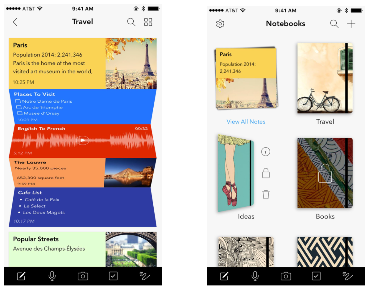
How much do we love note-keeping? As much as one loves to maintain journals, the creative freedom belies as soon as the notes app is opened on a phone. Fancy attempts at replicating the paper feel have taken a backseat, when Zoho Notebook brought in the live feeling of maintaining e-journals or notebooks for note-keeping. From choosing colorful hand-drawn book covers to gently scribbling daily notes, the app lets any cradle journal-freak take ecstasy in product interaction.
However stark competitor products are, psychological behaviors and mental maps of users are patternized — so ideally, products don’t change the way perception happens. That’s why you see ‘cropping’ or ‘zooming’ actions represented by similar icons in most products. Products with good affordances aid in enhancing user interactions and decrease ambiguity.
“Long story short — produce behaviors and perceptions, and actions will automatically follow.”
Keep reward and reciprocity at the helm
Right before the launch of a product, the product teams are crystal-clear about something; they want both parties to win — both customers and themselves. This coherence somehow hazes with mundane priorities, but the last thing product folks want to see is getting their purpose ceded. As we waltz through the libraries of social psychology, hidden in them is a principle called reciprocity. It’s not uncanny to believe that people will be willing to show enthusiasm towards something if they can perceptually believe that they’re offered a bonus rather than an onus.
As a social construct, reciprocity causes people to take interest and commitment towards completing an action because they’ve seen a tangible benefit through what you provided to them — exactly befitting your product usage. Reciprocating a behavior is a strong determining factor of human psychology, specially done towards doing good for both parties involved.
In fact, the bestselling author, Nir Eyal, also initiates the same discussion in his ‘hooked’ principle, which is all about forming a habit around products. With products, the key lies in TARI — trigger, actions, reward, and investment. It’s a clear behavioral theory wherein:
• The product gains the attention of users (Trigger)
• It gives them a way to solve their problems (Action)
• It enables users to see the palpable recognition or gain from time to time (Reward)
• It instills the thought of commitment and loyalty (Investment)

It’s critical that one understands ‘rewards’ don’t signify monetary or material benefits. Reward is again a psychological catalyst that kindles user reactions and responses — so, every product needs to figure what they’d specifically offer to benefit from users’ interactions. An ideal reward could mean simple (and variable) gestures of content, promotion, or positivity, that enable more desirable actions from users in the future.
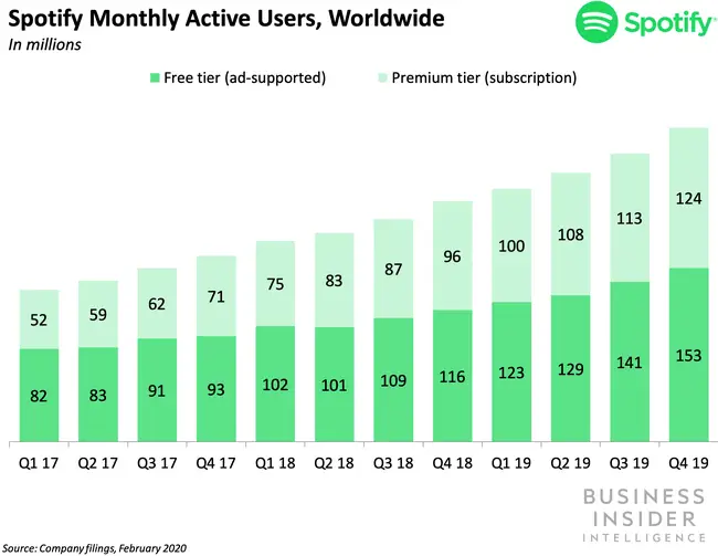
Spotify has been a household name rather than a standalone product in recent times. Reason? It’s not viewed by users as yet another music platform, though that’s exactly what the product intends. In fact, Spotify has secretly worked magic with the kind of reward they want to provide their users — hyper-personalized songs, playing one after another, to an extent where the listener wonders whether their mental playlists were stolen. The matches lead you to songs that you believe in as well as ready to tune into. Thanks to the mechanism (towards the reward) that entails:
Collaborative filtering: A technique to understand demographic stats and data. If you’ve listened to some song, and that pattern matches with other users, their playlists become your recommendations in the queue — in turn you discover unearthed favorites and new suggestions. (How Amazon or Netflix recommendations work too!)
Natural Language Processing: Most of you would have heard about story-web, and that’s what happens with NLP models. The models crawl the internet for blogs, content, social media posts, comments, artists gallery, and every bit of relation with a song’s lyrics, artist, and playlist.
Audio models: This is again a constantly enhancing pattern of Spotify, wherein raw audio files (for timestamps, tempo, loudness, frequencies) are processed by convoluted neural networks to batch them into different categories.
Though the reward of a user listening (read interacting with) to amazing recommendations involves so much in the backend, there’s another concrete reward a freemium user gets to experience. The free ad-included account plays the promotional (well-scripted) audio clip that behaviorally pushes a user into the thought of experiencing ‘uninterrupted music’ for soulful times. And, yes, the reward that comes in — 30 minutes of no-ad period — is a hook for a freemium user, enabling them to upgrade. But, hey, this isn’t a long-term reward, but Spotify however matches it up with the previously-said personalization.
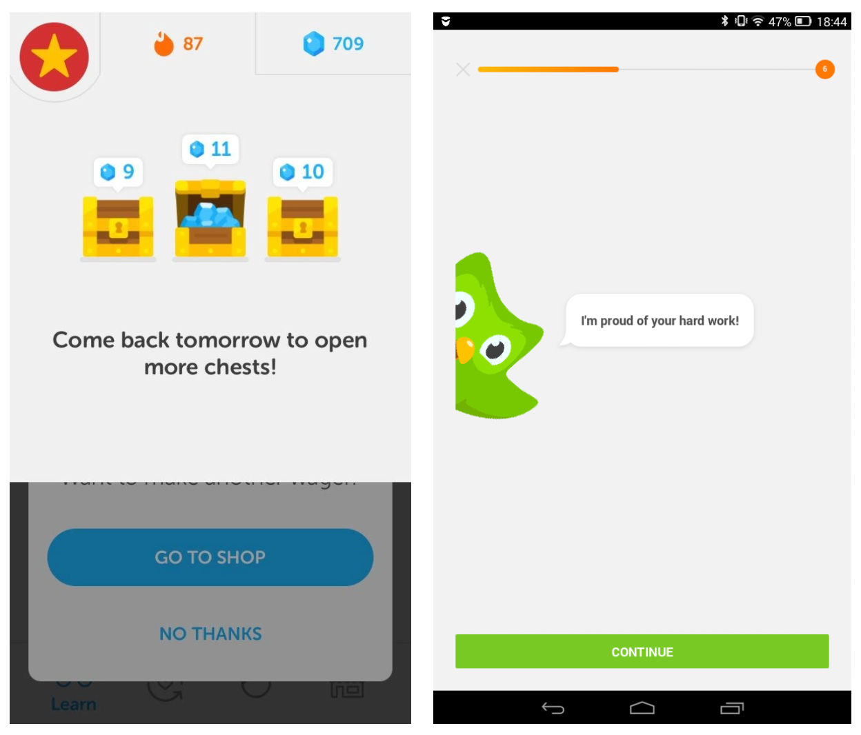
Duolingo, the language learning app, gets their version of reward right — showing smile-worthy congratulatory messages and digital brownie-points collection. This way, even a learner who is just progressing through their nonchalance can get their hook a bit faster. Well, it’s an investment for both parties, you see?
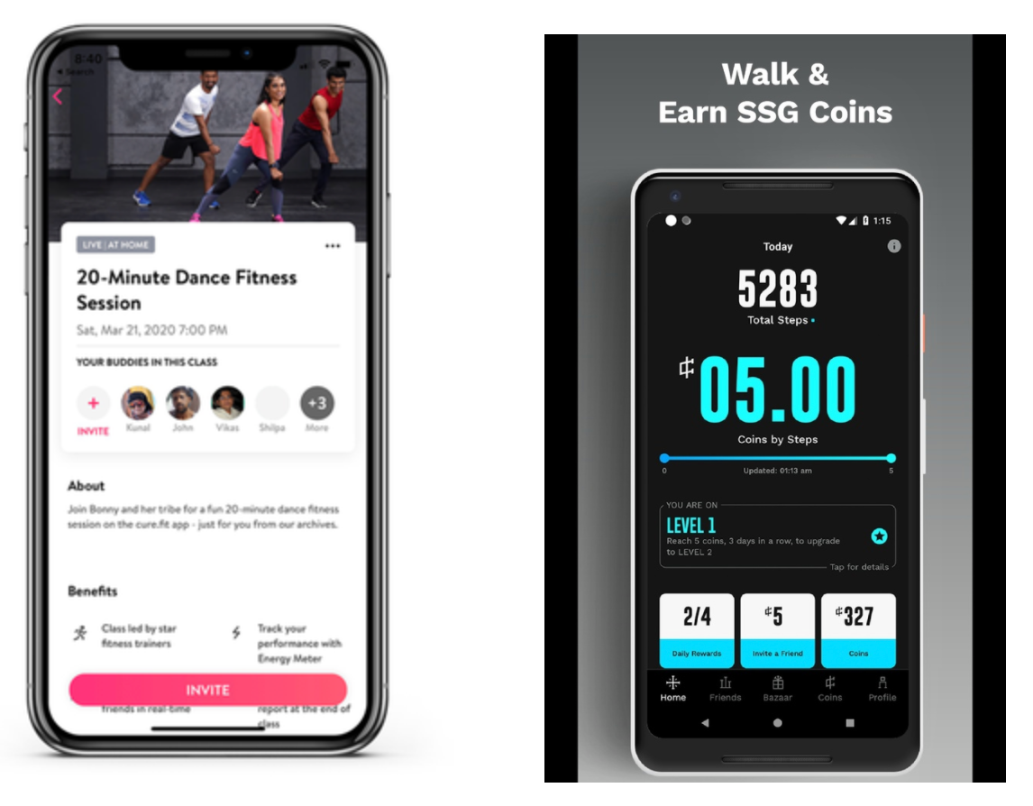
Two products of similar kind have ventured into health and fitness, building the same habit focus for users. The live sessions cure.fit provides are rewarding — from the way they project it on the interface with the messaging to the whole workout experience they give the users, keeping their time investment in mind. Celebrity endorsements, live fit sessions, and digital rewards, are just some ways through which cure.fit has found its niche to enhance product interactions.
The next in the same deck is StepSetGo, a mobile-app only product, that helps users not only stay in shape but also collect goodies for every effort they put in. And, these goodie coins that a user virtually collects can be directly used to shop health-focused rewards — from attire to eateries, right within the app. Well, an end-to-end plan for hook!
Rewards can also be stitched easily with in-product messaging. Pop-ups, surveys, contextual videos, how-to tips, and a lot more of these content-based rewards build the pavement for better user engagement and brand accessibility. Treat your product as an arena and every user action as a goal, so you’ll ultimately ensure to give users the happiness of scoring.
“Precisely, make your users realize the reward that your product has in line with every interaction. Reciprocally, they’ll perform better.”
While there are many such psychological theories and observations, the essence of the three stated here is that they’re not induced; product managers, marketers, or designers, needn’t forcefully engage users, as these three nudges are innate. Recognition, affordances, and reciprocity, are naturally-occurring behaviors of a human mind. And, the next time you look out to fund strategies to improve product interactions, don’t forget to tap into these three that already have a laid foundation in your users’ mindset.


