
There are moments you learn the meaning of something for the first time, but immediately after which you start to experience its occurrence. Learning what Horror Vacui stood for was one such incidents for me. The first time I came across this phrase, my mind thought of a filmy or a theatrical reference. But, it’s a Latin phrase very popular in visual art [I heard this phrase from an artist/visual designer originally] that means—fear of empty spaces. It’s similar to the Greek reference ‘kenophobia’ which denotes the fear of void or barrenness. Artistically, I was more intrigued to know why there should be a fear in the first place and how it’s reflected.
The perception – A glance
Horror Vacui dates to very early Greek art days, wherein it was considered as a style quotient—artists started populating their paintings with intricate patterns and adorning sculptures and architecture with excessive, closely-knit ornamental details. Let’s take our everyday practices too, you’re most-likely to buy from a convenience store that’s packed with a lot of things on the shelves giving you a ‘fully stocked’ visual effect through the glass doors, when compared to a half-empty or a partly-stocked store.
But, not everything is seen from this eye. When this effect of Horror Vacui is applied in the retail consumer psychology, the inverse proportion is true too. Bigger the brand and luxury being a symbol, the store fronts hardly show a few statement pieces, as compared to a wholesale or a less-posh outlet. In fact, the products you sell can also shape the whole ‘space’ or ‘no space’ arrangement on storefronts. In fact, an interior design game show I enjoyed on Netflix had an episode dedicated to revamping retail showrooms, and it was interesting to see how both contestants and judges had a variety of thoughts around the space and arrangement.
Less clutter, more space, and better projection have their own signature style. So, this way, the concept expanded beyond visual art and started getting applied across a lot of streams.
Design & storytelling
An experimental observation following this less-clutter concept I’ve seen is Jack Butcher’s Visualize Value. It’s great to see how he simplifies paragraphs of content with a very simple design. It speaks volumes without flooding the surface with patterns and doesn’t give a person any pain in understanding.
Benefits of a clean design:
– Communication is clear.
– Less mental energy to consume information
– Better recalling for the details.
– Constructive value delivered and beauty preserved even without cognitive burden
For those who may think doodles, mandalas, and zentangles are contrasting forms of art, filling in the spaces, there’s a difference—cluttering the spaces simply for attention is different from deriving an artistic pattern out of them.
Marketing & advertising
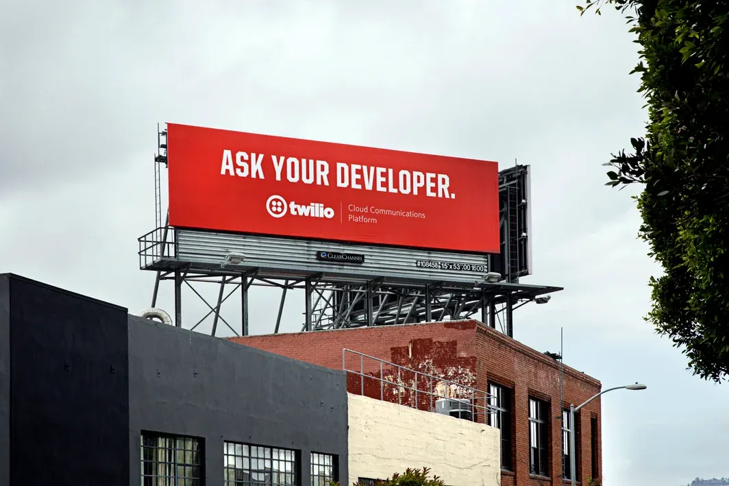
All of us are aware of the power of brevity in content, especially when used as a part of advertising or technology marketing campaigns. How much value you convey and what level of curiosity you kindle all lie in the few lines of content you craft. Jeff Lawson’s example of the Twilio OOH campaign is very apt here. Instead of elaborate or cliched visuals and captions, Twilio’s approach to this bright red billboard in one of the city’s prime locations was unique. With a product that most non-tech people won’t immediately relate to, they hunted for ideas to convey what the company and the tools stood for. In order to improve their target audience’s (software developers) influence in decision making as well as make more people aware of developer tools such as what Twilio is providing, their huge billboard had just 3 words filling the main space—Ask your developer—along with their logo and tagline. Yes, no windy “use this for….” or slipshod graphics. Just a plain simple phrase that spoke in depths.
Product & user experience
The very same let’s-fill-the-space approach works well for designing product interfaces too. The implications of feature creep or feature fatigue, a means to stuff a product with way too many features to project sophistication is the fastest way for customers to lose charm. The reason we enjoy the clear onboarding process of a software product or informational emails from brands we subscribe to is the simplicity they provide to trigger our actions.
Let’s recall a simple form filling experience—say, you want to subscribe to a newsletter, and upon seeing the signup form, you see that it’s full of fields and asks a lot of information from you. Do you still have the same degree of interest in signing up? Probably not. Most often, users get dropped midway through a product because the setup process takes way more steps than required. Theoretically, Hicks Law is based on this—letting a user take action within minimum time and options. So the more options you provide, the more time they’ll take for an action (sometimes dropping it totally).
Coming back to Horror Vacui, the term originally signifies fear, but recounting a number of everyday scenarios in our product world, I see that the fear translates to the concern that the impact wouldn’t be felt enough—in visual art, copywriting, product, or anything. But, if only we move beyond this, maybe we could see success in simplicity!


