
For a while, I had this urge to make my website feel more like me.
It already had the usual pieces: an about page, old essays, poems, work links, art, podcasts, a newsletter, and all the little proof-of-life trails one gathers after years of making things on the internet. But I kept feeling that it could show more of my rhythm. Less like a clean portfolio page. More like a space with many tabs open, because that is usually how my mind feels too.
So, when I started redesigning aishashok.com, I was not really asking, "How do I make a better portfolio?" I was asking: what would it feel like if the site opened like my desk?
That question made the build more fun.
The first version became a desk/scrapbook world. A paperclipped photo opens About Me. A retro computer takes you to Product & Tech. A small shelf of books opens Poetry. A folder holds the apps I built. A painter's palette points to my art shop. A turntable plays The Founder's Foyer. A tiny airdrop card carries the newsletter.
This felt closer to how I wanted someone to browse. Not through a perfect hierarchy, but through objects.
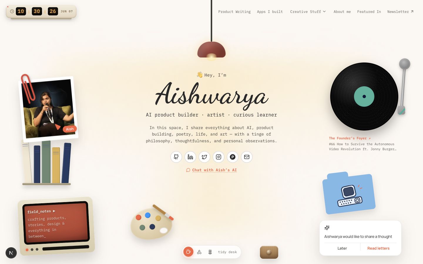
I have always liked when digital things borrow from physical things with a bit of restraint. A desk is not just furniture. It is a working memory. It has the notebook you keep reopening, the coffee that says you stayed longer than planned, the current project, the abandoned thought, the one object that makes sense only to you.
That was the feeling I wanted for the site: personal, a little tactile, playful, but still clear.
The real work happened in the tiny decisions after the first version. I kept asking: does this object only need to link somewhere, or can it do one small thing?
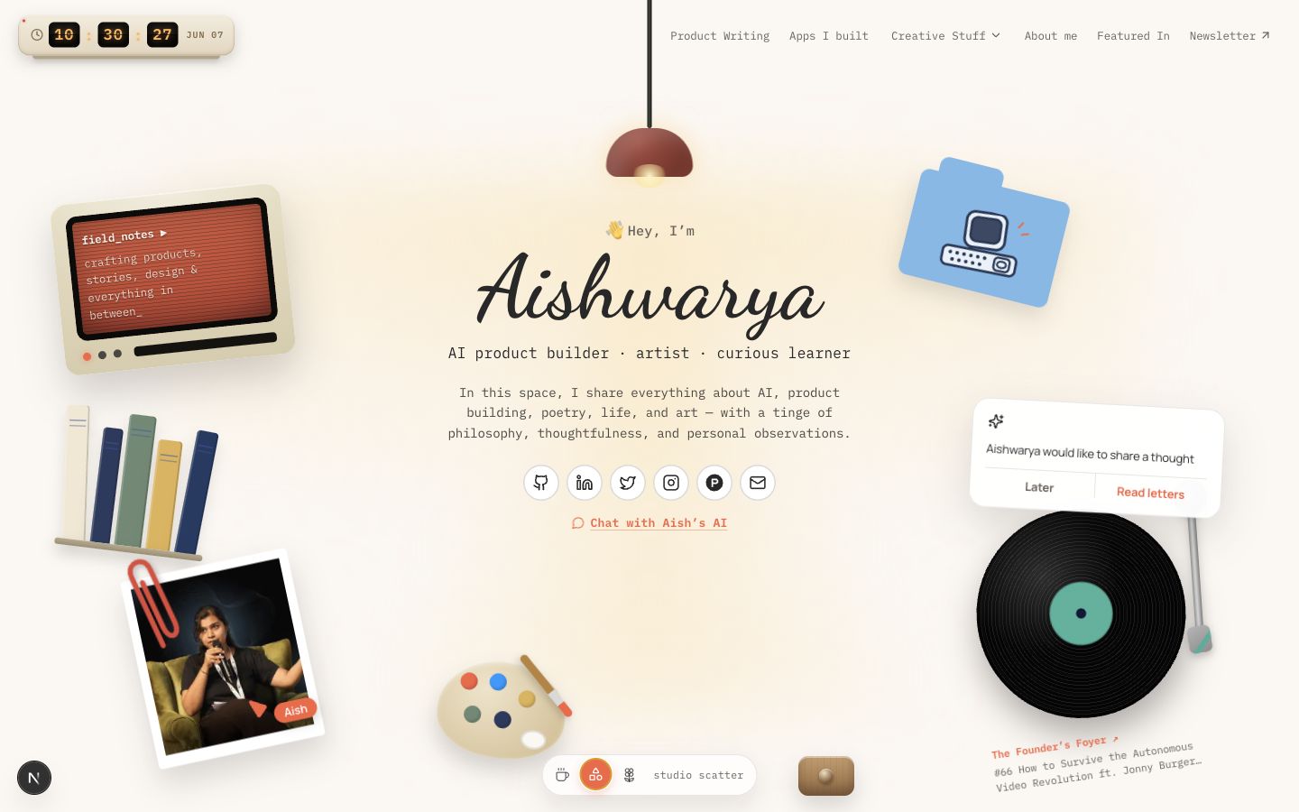
The lamp could turn on and off. The cursor could split into "Aish" and "You", almost like both of us were inside the page for a second. The modes could move between "tidy desk", "studio scatter", and "focus". The turntable could preview the latest Founder's Foyer episode on hover. The folder could hold my tools, hardware experiments, and AI projects without feeling like a plain project grid.
These are small things. But, they are the things that make a site feel cared for.
This is also where AI was genuinely useful. Not in the "make me a website" sense. More like: help me stay in the loop long enough to make this tiny thing better.
Opus 4.8 was helpful for the design side. I used it to think through the visual direction, the desk metaphor, the little moments of delight, and whether the page still felt like me after each change. It was good for wandering around the idea before locking it down.
Codex 5.5 was useful in a different way. It became the builder-reviewer. It handled the migration checks, the review passes, the "is this route still reachable?", the "does this break mobile?", the "are there scroll issues across devices?" parts. Not glamorous work. Very necessary work.
And, that is the thing I appreciated most. AI helped with both sides: the playful possibility and the patient cleanup.
Then came the drawer.
I love that the drawer is not necessary. It sits near the mode dock, slightly hidden. When you open it, you find product principles, things I love, and a fortune cookie you can crack open. It has a wooden slide sound. The cookie has a snap. The fortunes are lines I keep returning to in my own work: "Build the thing you keep wishing existed." "Delight is just usefulness that remembered you were human." "You don't find your taste; you build it, one rough draft at a time."
That drawer became the clearest version of what I was trying to make.
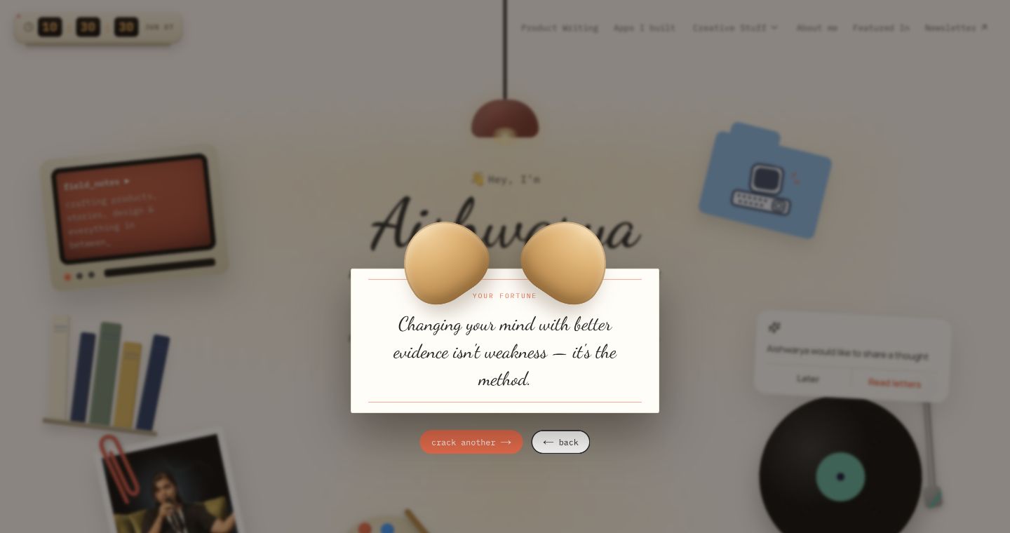
A personal website should not only say what you do; it should reveal how you notice.
The noticing mattered in the quieter parts too. I had to clean up the old WordPress feeling so the site did not read like a migration wearing a new outfit. I wanted the older essays and poems to stay individually available, even when some images or paths needed care. Codex 5.5 helped separate what had actually moved over from what was still remote, check sitemap and redirect behavior, run content audits, review responsive issues, and keep the Vercel path honest.
There is romance in a scrapbook, yes.
But, there is also plumbing.
Building with AI made that very visible. You can move quickly from a visual idea to code, from code to a working interaction, from an interaction to a review pass. But moving quickly does not remove taste. It gives you more chances to practice it.
The first desk was fun. Then the mobile hero felt too right-aligned, so the work became about balance. The photography page had the right interaction model, but the gallery needed to feel calm in the grid and generous when opened. The Product Hunt link needed the proper icon. The page needed to behave across real screen sizes, not just on the one screen where it looked cute.
That is what delight became for me in this redesign. Not decoration. Care.
The lamp clicks. The drawer slides. The cookie cracks. The cursor feels like a small shared presence. The photography opens properly. The old writing is still findable. The page does not wobble because someone visits from a smaller screen.
Every iteration came back to the same question: does this feel like me, and does it still work for someone else?
That second half matters. A personal website can become too inward very quickly. The desk metaphor only works if a visitor can still find the thing they came for: About me, writing, product work, apps, art, photography, podcast, contact. The play has to help the path, not hide it.
So, the redesign became part archive, part playground.
Archive, because the old essays, poems, work, and links needed care. Playground, because the current version of me is building with AI, making little tools, teaching agents taste, sketching cities, hosting conversations, shooting with a Fujifilm, and generally obsessing over many things with questionable amounts of joy.
The site had to hold both.
What I like most about the final direction is that it does not force one clean identity. The product builder, artist, writer, podcast host, tinkerer, and curious learner get to sit on the same surface.
Not as a resume.
As a room.
Maybe that is what I wanted all along: a website that does not compress me into a headline, but gives my curiosities a place to live.


